Low Fidelity
We cleaned up and provided structure to our sketches and created a low fidelity prototype. Our main focus was how the different features and content of the website was presented and organized. At this stage of prototyping our priority was on page layout and spacing to maximize user success and minimize user confusion with consideration to the different experiences of the desktop and mobile site.
A key difference between our sketches and low fidelity prototype was modifying our Event "Quick Links" at the top of the Events page from displaying Upcoming and Recurring events to displaying Upcoming Events, New Member Events, and Branch Meetings. These categories would be more useful to have quickly accessible to new users who are unfamiliar with where to start and general members who primarily only attend the major meetings and would not want to sift through the entire calendar. Additionally, on the Calendar "List View" on the Events Page we added additional navigation arrows below the list as to not require users to have to scroll up just to move from week to week, especially when they are at the bottom of the list where they would be more likely to have to click through forwards or backwards. We also included a "Jump to Calendar" button at the top of the mobile version of the Events Page as to minimize the amount of scrolling needed of users who just want to go straight to the point and jump directly to the calendar. In our Event Details page we added a back button to allow users to return to the calendar directly instead of having to go through the main navigation menu again. We also added an "RSVP" feature so users can submit their contact information to register for the event as well as receive further information about attendance. In the mobile version of the Event Details page we moved the "Event Details" section to be above the "Event Description" section so users can quickly access the key information about the event and how to attend.
Desktop

See our Invision Low Fidelity desktop prototype https://bit.ly/dsa-desktop-lowfi!
Mobile

See our Invision Low Fidelity mobile prototype https://bit.ly/dsa-mobile-lowfi!
Mid Fidelity
Desktop
Mobile
We implemented the feedback from our low fidelity usability tests and began incorporating style and color to our design. Our focus while creating our mid fidelity prototype is to incorporate UI features that would create a welcoming environment for users who are new to DSA which potentially carries a stigma, have a design that reflects the spirit of the San Diego community, all while adhering to the national style guide.
Mid Fidelity Prototype User Testing
We wanted to get feedback on our prototype before continuing with refinement to progress to the high fidelity stage. Our user feedback during this round of testing was more focused on our style approach.
Users found that while our design was a lot more colorful and lighthearted than the original, users found that the design veered into almost a "candy shop" style aesthetic. Pleasant and approachable aesthetics shouldn't be at the behest of professionalism, and we needed to find a way to balance the two. We spoke to individuals with a graphic design background for advice and while they understood the reasoning behind our approach, they suggested that we could tone down our design while maintaining approachability by integrating soft gradients and not feeling the need to keep everything placed inside a container. Gestalt principles of proximity will indicate to users of the grouping of related information without needing to draw a literal box around them.
After user testing and reflecting on our design, we realized that although our design has a lot carefully prototyped details and UI elements, we need to consider the realistic feasibility of our design. Even though it's fun to try to flex our prototyping skills and create enjoyable microinteractions, the real San Diego DSA website is maintained only by a small number of people who don't have time to code and implement our complex visual design features. We need to be practical and conscious of real-world constraints or else our re-design will be useless. Productive design needs to be able to be implemented, otherwise it will just live and die on the Figma artboard and waste everyone's time.
High Fidelity
Desktop
Mobile
Sketches
Desktop

See our Invision desktop paper prototype https://bit.ly/dsa-sketch!
Mobile

See our Invision mobile paper prototype https://bit.ly/dsa-mobile-sketch!
We began sketching out ideas and creating a paper prototype of the mobile and desktop versions of our website redesign. Our main focus while creating our sketches was to address the usability issues we faced while conducting user testing of the original site as well as reorganizing the site to emphasize the desired key features and purpose of the site. Using the information we gathered during user research and testing, the features we liked during our analysis of different DSA chapter websites, and our restructured information architecture
Low Fidelity Prototype User Testing

Before proceeding with adding style to our design, we wanted to conduct some usability tests and get feedback about the ease of the user flow and the site layout.
Feedback we received from users included:
-
Users found the main navigation to be too big and too busy. Is there a way to present all the necessary main navigation features in a way that is sleek and not overwhelming?
-
The information in the footer is redundant with the information in the main navigation, and instead there should be more emphasis placed on the CTA to have users sign up for the mailing list.
-
Users found the text on the desktop version of the site too big and the text on the mobile version too small.
-
Users found the pages, especially the homepage to be too cramped. While we have made steps in the right direction by chunking out the site information to improve navigability and understanding, the pages still need more room to breathe. We should not be afraid of the use of necessary whitespace to prevent pages from becoming overwhelming. Design isn’t Jenga, we don’t need to find a way to jigsaw all the pieces to fit together in a neat, compact way. Sometimes it’s better to have the content spread out a bit more and prevent users from feeling crowded. How can we find a way to implement this while also minimizing potential user frustration by excessive scrolling?

Prototype & Test
With a design direction in mind, we began prototyping to bring our redesign to life. We focused on redesigning the header navigation, footer, homepage, Events page, and Organization page (under the "Who We Are" navigation tab) for both the mobile and desktop site.
Design
Style
Being a national organization, DSA has a preexisting style guide. So, while ideating for the visual design of the website we had to work within the constraints of the style guide. However, DSA is an organization that emphasizes and values community organizing at the local level, so we wanted to be able to reflect the distinct regional uniqueness of San Diego as well. Additionally, a goal of our website redesign was to create a user experience that felt approachable and welcoming to those who were unfamiliar with DSA.
Inspiration
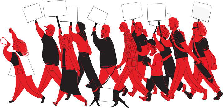
We drew inspiration from images of DSA events and protests. We incorporated the rose and fist motifs associated with DSA.


Color
DSA has an established and simple color palette: DSA Red, DSA Black, and white. These three colors, along with their tints, work well printed and on-screen.
We wanted to make the website bold, clean, and welcoming. We wanted to take the bright colors of DSA, and find ways to incorporate them in a way that is still striking, but approachable. We utilized the tints and gradients, and softened edges with rounded corners.
DSA Red is their primary color. It’s bright, bold, and serves as a strong anchor to the DSA identity.

Tints of the primary red color allows for variety if there is too much red or the design doesn't seem colorful enough.

There are also tints of DSA Black that can be used to allow for more range in use and visual design.

DSA Black is not fully black, but rather is more subtle and mixed with other colors to give it depth.

Font
The primary font for the organization is Manifold DSA was designed expressly for use by DSA. It should only be used for DSA business.
The webfont is Styrene B which is what we used for our main content.
Alternatives include Klima, Roboto (Slab), or Helvetica. Generally, they want the use of a modern, sans-serif font in keeping with their design examples.
Logo


DSA wants to maintain a consistent visual identity across their platforms, especially when it comes to their logo.
The multi-racial clasped clasped hands are the result of members of color pushing for a logo change, so it is important to honor that history whenever it is feasible by using black and white in the logo. It is preferable for logos to have a background color of DSA Red.
There are also guidelines for the size and placement of the logo relative to its container. The logo isn't vertically centered. It follows a ratio of 5:13:2, with 5 the space above the logo, 13 the height of the logo, and 2 is the space below the logo. There should additionally be a gutter of at least 20% around the logo.
We wanted to have regional distinction in the style of the site, so we iterated on the original logo and (while following the national design guide) we added a palm tree to make it feel more personal to San Diego.
Information Architecture
Card Sorting


Actions
Organization Work
Connecting With the Organization
About the Organization
We grouped our topics into 4 categories, topics that inform the users about the organization, the work the organization does, actions that users can take, and ways to contact the organization. We can see that "News/Posts" falls under both "Organization Work" and "Actions" indicating that it is an important feature that should be highlighted. "Resources" is a menu header, with its submenus being able to fit elsewhere in different categories which means that it can be removed and place its topics into intuitive groupings.
From our usability tests we found that users were able to use the main navigation bar with ease to browse through the site and find their desired pages. However, there were sections of the site that were very dense which led users to feel confused and overwhelmed. We conducted card sorting to see how we could categorize and group different the different topics on the site to see if there was a way to maintain the intuitive navigation of the site, while also being able to create a more productive and painless experience for our users. For card sorting we used the title of menu items (seen in black), as well as the submenu pages and distinct features that were on a page that could potentially be pulled out as its own section.
Site Map

From our findings through card sorting and usability tests, we created a site map. We mostly menu items using the groups from card sorting, but made "News" and "Events" their own individual primary navigation menu items because of their importance. We added "Site Search" as a utility since it was a feature users wanted to see. Additionally, we added "Language Support" and "Accessibility" utilities to accommodate as many users as we can. San Diego has a high population of Spanish speakers so it was important that we had language support on the site. Important CTAs such as "Donate" and "Join" were both a site utility and in the footer so it is as accessible and noticeable to the user as possible.
Competitor Analysis
The Good
-
Clean, readable navigation menu with hover interactions and selection indications.
-
The logo and images used reflect the city of Los Angeles
-
Immediate calls to action to get involved visible on the homepage and menu
-
Language support offered
-
Events page has a search bar and allows for users to toggle between a calendar list, month, and day view
-
Events link to their individual specific page with information about the event date, time, category, and location.
The Bad
-
Language support not available on every page and is located above the navigation bar, and would be hidden upon scrolling
-
No site search, despite density of information available on the site
-
UI is plain with inconsistencies in sizing and style


The Good
-
Footer is clear and invites users to provide contact information and subscribe to their newsletter
-
UI is consistent throughout the site
-
The site contains links to several other resources and partnered organizations to be able to connect and get involved easily
-
Events calendar is easily navigable with events clearly indicated and each event leading to its own details page containing information about the date and time
The Bad
-
UI is plain and text heavy
-
Aside from the logo, the website doesn’t seem to reflect the city and people it represents
-
Navigation menu is hard to read with no indications for clickability and selection
-
Icons on events page aren’t clear as to what their call to action is and text is small


The Good
-
The incorporation of drawings and images reflects the community
-
The controlled use of red makes the site less intimidating, and makes the organization seem friendly and approachable
-
The events page calendar has a week, month, and list view.
-
Events that are helpful for new members are listed at the top of the page.
The Bad
-
Does not follow DSA style guide
-
Design is plain
-
Site is not designed with a “mobile-first” mindset, and the mobile version of the site is difficult to navigate.
-
Event details and registration is difficult to access

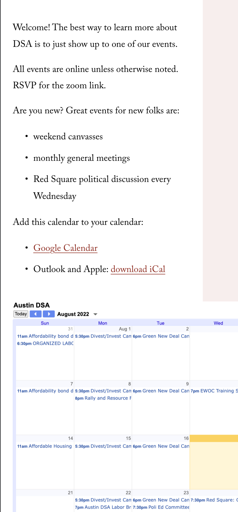


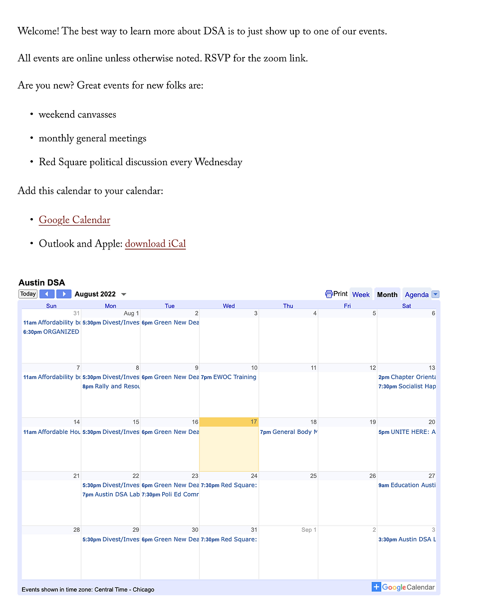

Since this is a national organization, we have a lot of chapters to use as reference material for features we would like to include in our redesign, as well as features we would like to stay away from. We wanted to examine the chapter websites of other major cities in California, as well as another non-Californian DSA chapter in an area with a similar population demographic breakdown as San Diego with a high percentage of Hispanic people.
From our analysis of the Los Angeles, San Francisco, and Austin DSA chapter websites, we found features we want to incorporate in our website redesign.
We want to include:
-
Immediate and noticeable calls to action for members to get involved
-
A friendly UI that conforms to the national style guide while also reflecting the San Diego community
-
An events page with a calendar that toggles between week, month, and list views, with events clearly indicated and highlighted on the calendar.
-
A specific page linked to each event containing details including date, time, and registration information.
-
Mobile-first design
-
A site search feature
-
Language support that is easily accessible
We will improve on the current website by making our redesign have more of an emphasis on appealing to newer members as well as reorganizing content and structure to improve comprehension and ease of use.
Define
Problem Statement
Users have difficulty navigating the DSA San Diego website to find necessary information due to the density of text, unclear visual design, and lack of affordances which creates an experience that is overwhelming and confusing.
How might we redesign and improve the DSA San Diego website so that...
-
our users can be able to successfully navigate the website and find out information about the organization and how to start getting involved with minimal frustration
-
San Diego DSA experiences an increase in involvement and membership
Research
We began our redesign process by conducting user interviews to try to understand what users know and how they feel about DSA, as well as political and community organizing.
Our objective was to find an answer to the question
“Why would someone go on the San Diego DSA website?”
Research Objective
User Personas

Meet Rosa Gomez. She’s politically motivated to say the least. A Political Science grad student at UCSD, she reads the news daily and is an active participant in local campaigns, legislatures, and outreach. She’s a DSA member, and she visits the SD DSA website frequently to catch up on upcoming events and posts.
On the other hand, we have Maria Cruz. She’s also a grad student at UCSD, but for Biology. She doesn’t know much about DSA or Democratic Socialism, and is already stressed enough to invest much time or energy into electoral politics. But she definitely leans “left”, and has always been interested in social causes, such as housing justice after growing up in low-income housing. But she doesn’t even know where to begin. One day she sees a post from San Diego DSA retweeted onto her feed talking about an eviction moratorium, with a link to the San Diego DSA site. Intrigued, she forays into the DSA website to see if she could learn more about DSA, how to get involved, and what kind of projects they work on.
Through our interviews we found there was a sharp contrast between our participants, which we represented in our user personas.

Through our interviews we found there was a sharp contrast between our participants, which we represented in our user personas.
Meet Rosa Gomez. She’s politically motivated to say the least. A poli-sci grad student at UCSD, she reads the news daily and is an active participant in local campaigns, legislatures, and outreach. She’s a DSA member, and she visits the SD DSA site frequently to catch up on upcoming events and posts.

And on the other hand, we have Maria Cruz. She’s also a grad student at UCSD, but for Biology. She doesn’t know much about DSA or Democratic Socialism, and is already stressed enough to invest much time or energy into electoral politics. But she definitely leans “left”, and has always been interested in social causes, such as housing justice after growing up in low-income housing. But she doesn’t even know where to begin. One day she sees a post from San Diego DSA retweeted onto her feed talking about an eviction moratorium, with a link to the San Diego DSA site. Intrigued, she forays into the DSA website to see if she could learn more about DSA, how to get involved, and what kind of projects they work on.
The dichotomy of our user personas actually came as a surprise to me. As someone who has been involved with DSA and similar organizations as well as primarily being surrounded by people who are also involved with or at minimum aware of DSA I didn't realize that my experiences and perspective wouldn't be universal.
This process highlighted the importance of not only just user research, but comprehensive user research that seeks to understand a broad range of people. As a designer, I'm not creating a product for just myself (and my team). My personal biases should not stand in the way of designing an experience that is enriching and enjoyable for all kinds of users. Research is the foundational step of the UX design process and it is important to take deliberate care as to have an encompassing set of data to draw conclusions from. Bias in data has historically resulted in major issues with legislature and practices derived from statistical research analysis as well as machine learning algorithms. While our case is not as extreme or potent, cultivating good research practices will result in long-term net good.
.png)
User Insights
Despite their different perspectives, we found that these two personas’ needs for the website converged.
Users, such as Rosa and Maria, who are passionate and eager about making a change in their local San Diego community want to use the SD DSA website to learn more about DSA and what they stand for, to find out about the actions and projects they are working on, and to sign up for upcoming events to attend and be involved with.
And for users like Maria, they want to feel welcomed and not overwhelmed while dipping their toes into something new.
Stakeholder Interviewer


In addition to finding user needs, we were able to conduct a stakeholder interview with the organization to learn how San Diego DSA used their website and what they wanted from it.
They use the website as a place to give organizational updates, and also as a repository for administrative information about the chapter. And they want a website that is clean, informative, and easy to maintain. But they would like to integrate some more educational material to their site.
Usability Testing
Homepage
-
Users found the homepage drab and not very attention grabbing. They can’t understand what DSA represents just by looking at the homepage and don’t find it very compelling.
-
The homepage had an overwhelming amount of text. Users liked seeing that DSA SD was doing a lot of work and could see their updates, but the content wasn’t spaced out or broken up by any images.
-
The red text on the white background was difficult to read with a contrast ratio of 4.39 which does not pass WCAG 2.0 AA accessibility standards.


We conducted usability tests of the current site to see what are the pain points of a user trying to navigate the SD DSA website that we would have to address, as well as strengths that we should maintain. We focused on the navigation, homepage, the organizational information page, and the events page on both mobile and desktop.
Events Page
-
The events page was easy to find and the page had a straightforward layout.
-
Users liked that the calendar had visual indications of which days had events scheduled.
-
Finding events and their information was very difficult for users. On mobile, there was no text indication as to what event was scheduled that day and users had to randomly click around on each day to find the event they were looking for. Users indicated that they would’ve given up at this point.
-
Event information was displayed as a hover modal that would cover the screen. The text is very small with registration links being unclickable with no visual distinction. Users also found that having the full URL displayed on the pop up confusing.


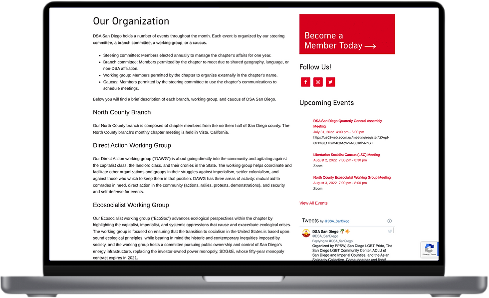
Organization Page
-
The title of the page wasn’t very clear that it would be where users should look to learn about what the working groups and branches of the organization are.
-
The information hierarchy wasn’t very clear. Users, especially unfamiliar ones, were confused as to what each group meant and were unable to visualize the structure of the organization.
-
The page was not very navigable, requiring users to scroll to get to whatever section they were looking for.

Navigation
-
There is no site search
-
Navigation is difficult to see due to poor color contrast and text size. The main navigation has a contrast ratio of 1.37 and the donate button has a contrast ratio of 3.71, which both do not pass WCAG 2.0 AA accessibility standards.
-
Navigation is not sticky, requiring users to scroll all the way back to the top to move between the site.


So...What Is Democratic Socialism?

Okay, then what's DSA exactly?
I know McCarthyian Red Scare makes people a little nervous about the word “Socialism”, but Democratic Socialism is just the belief that working people should run both the economy and society to democratically meet human needs, and not to just make profits for a few.

DSA is a political and activist Democratic Socialist organization (not an electoral party). Through a variety of campus and community-based chapters, DSA members use a variety of tactics, from legislative to direct action to fight for reforms that empower working people.
We focused on the San Diego chapter and the redesign of their website.
Project Details
Scope
-
Desktop
-
Mobile
Roles
-
UX Researcher
-
UX Designer
-
UI Designer
-
Project Manager
Tools
-
Figma
-
Miro
-
InVision
Website

Project Overview
There is a world to win and it starts on the world wide web. Democratic Socialists of America is a political and activist organization seeking to empower working people. They believe in community organizing and outreach through local chapters, and would therefore need a website that is easily accessible and understandable by the whole community, not just those familiar with DSA. Working with the San Diego chapter’s website, we restyled and restructured the content to maximize information intake for both current and potential members.
.png)
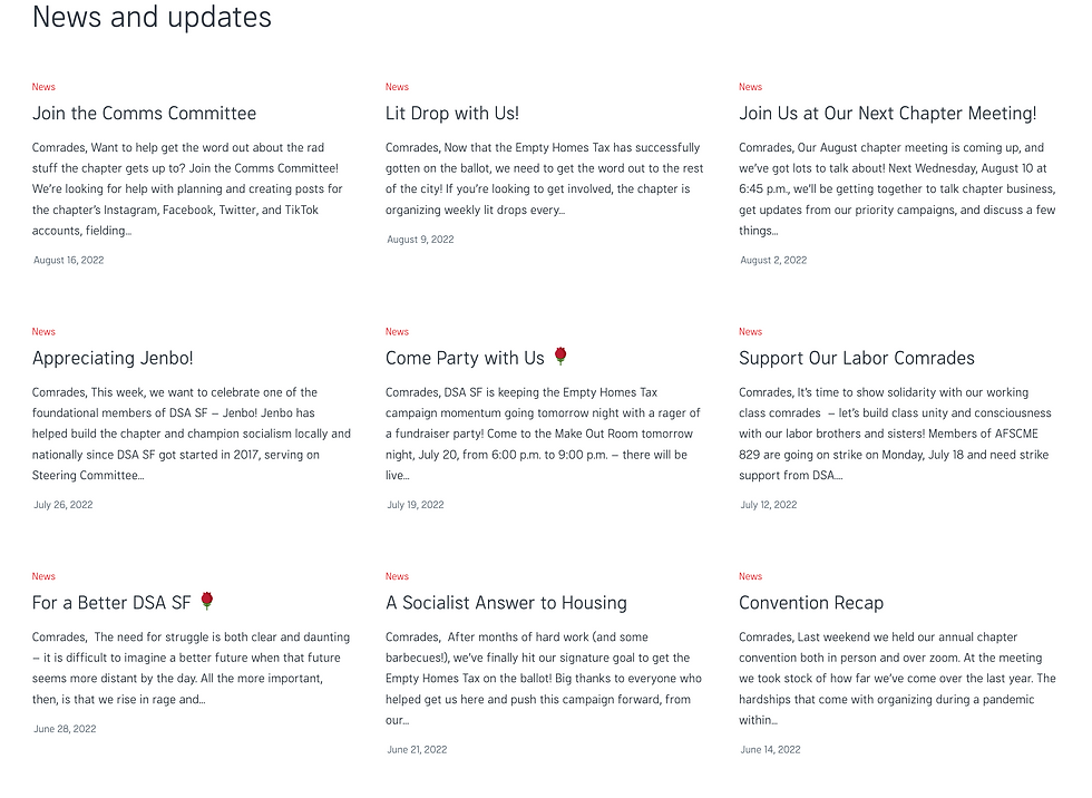
We want to conduct a redesign of the News page. There’s a lot of room for improvement and ideation, and it's a section of the website the organiation wants to emphasize.
We want to organize and categorize meetings by their related working group to have users be able to visually distinguish and find events of interest quickly.
We want to develop the pages of a few other campaigns not included on the website, but important to the organization, for example Housing Justice.
Develop a lightbox feature in lieu of a separate page for donations for the ease of the user.
Future Work